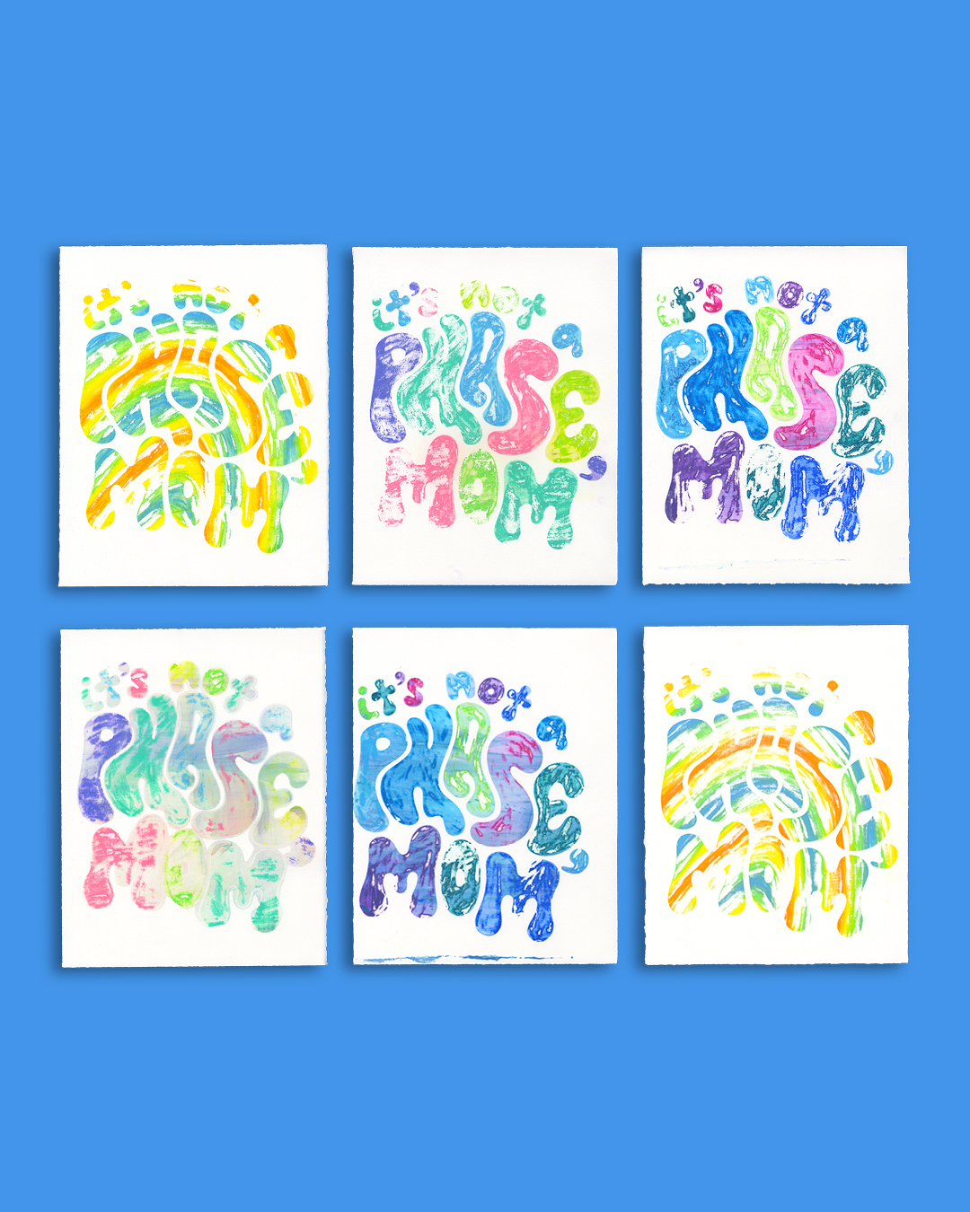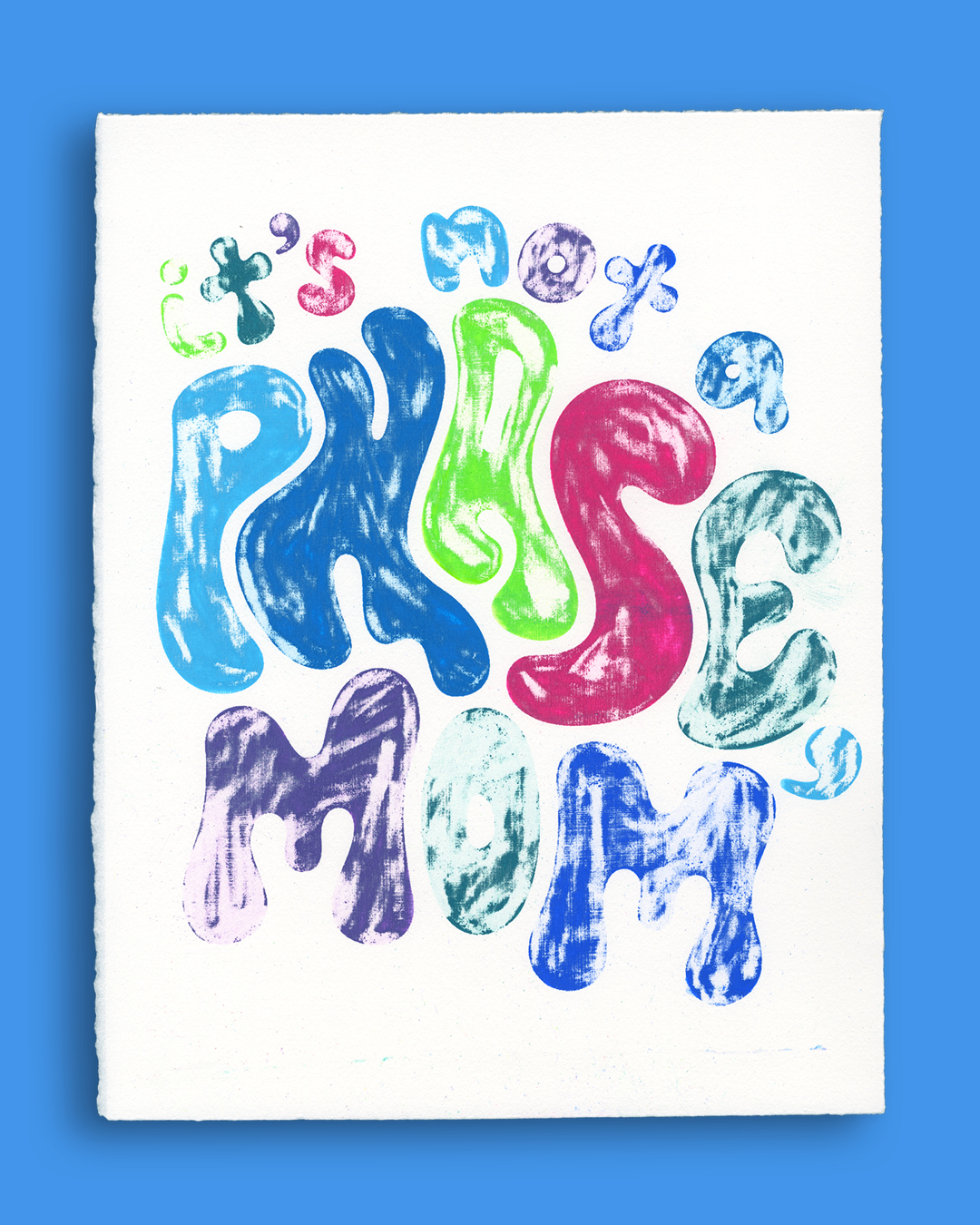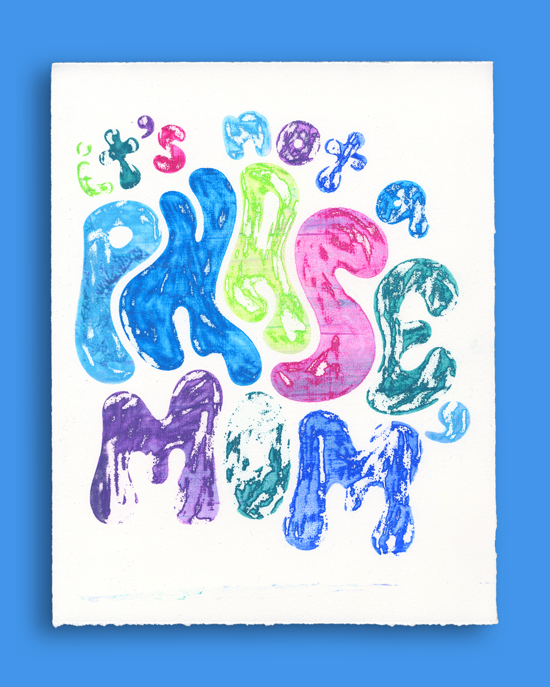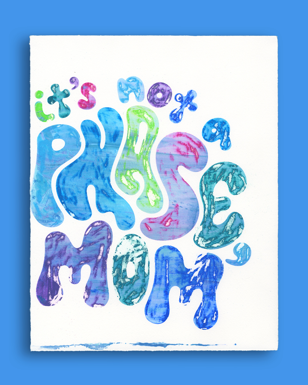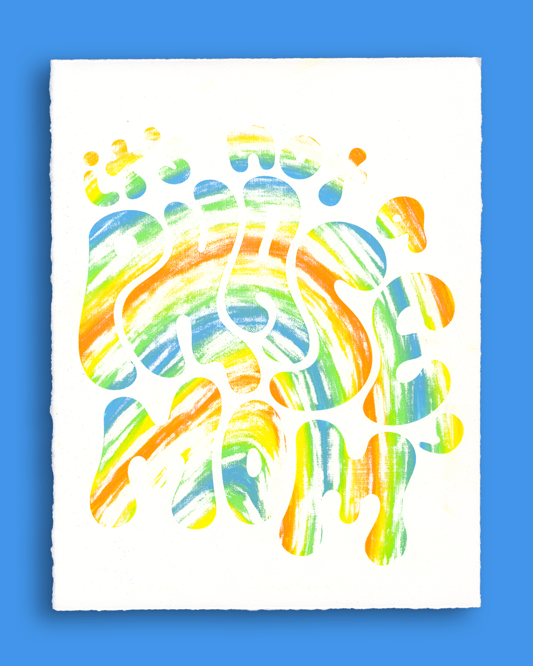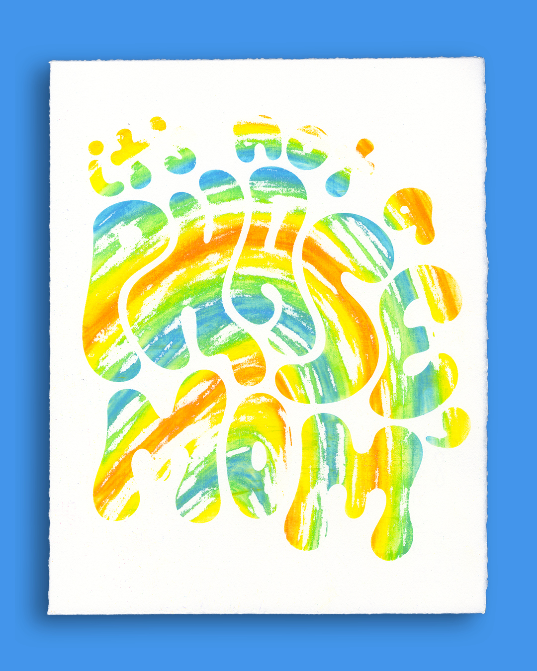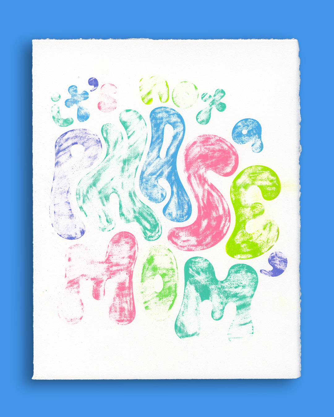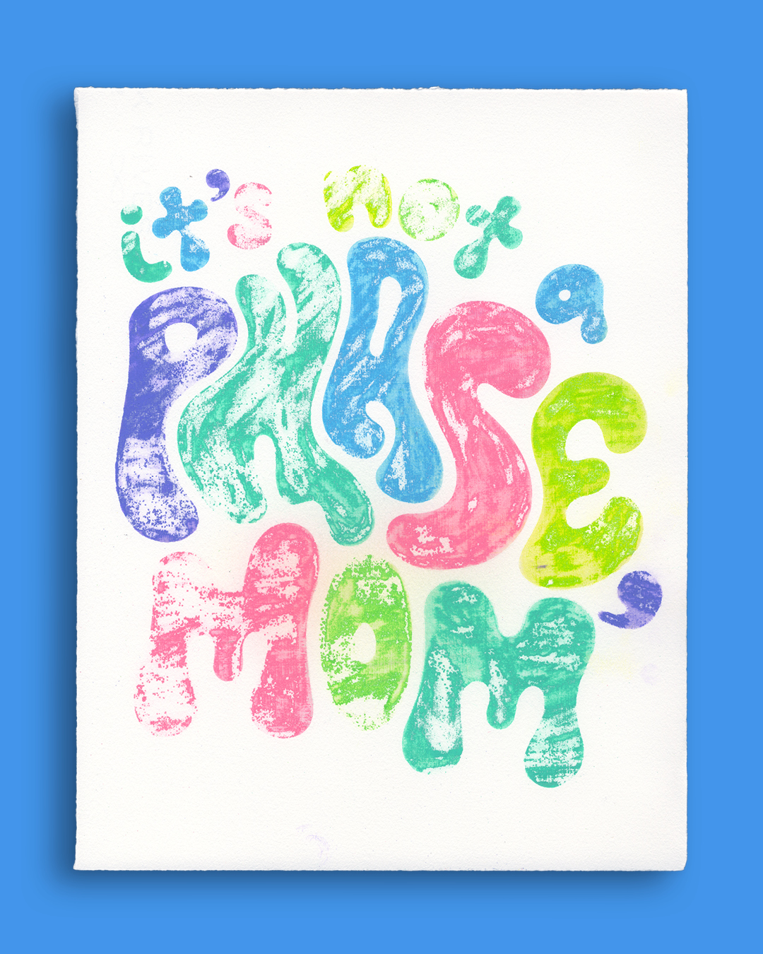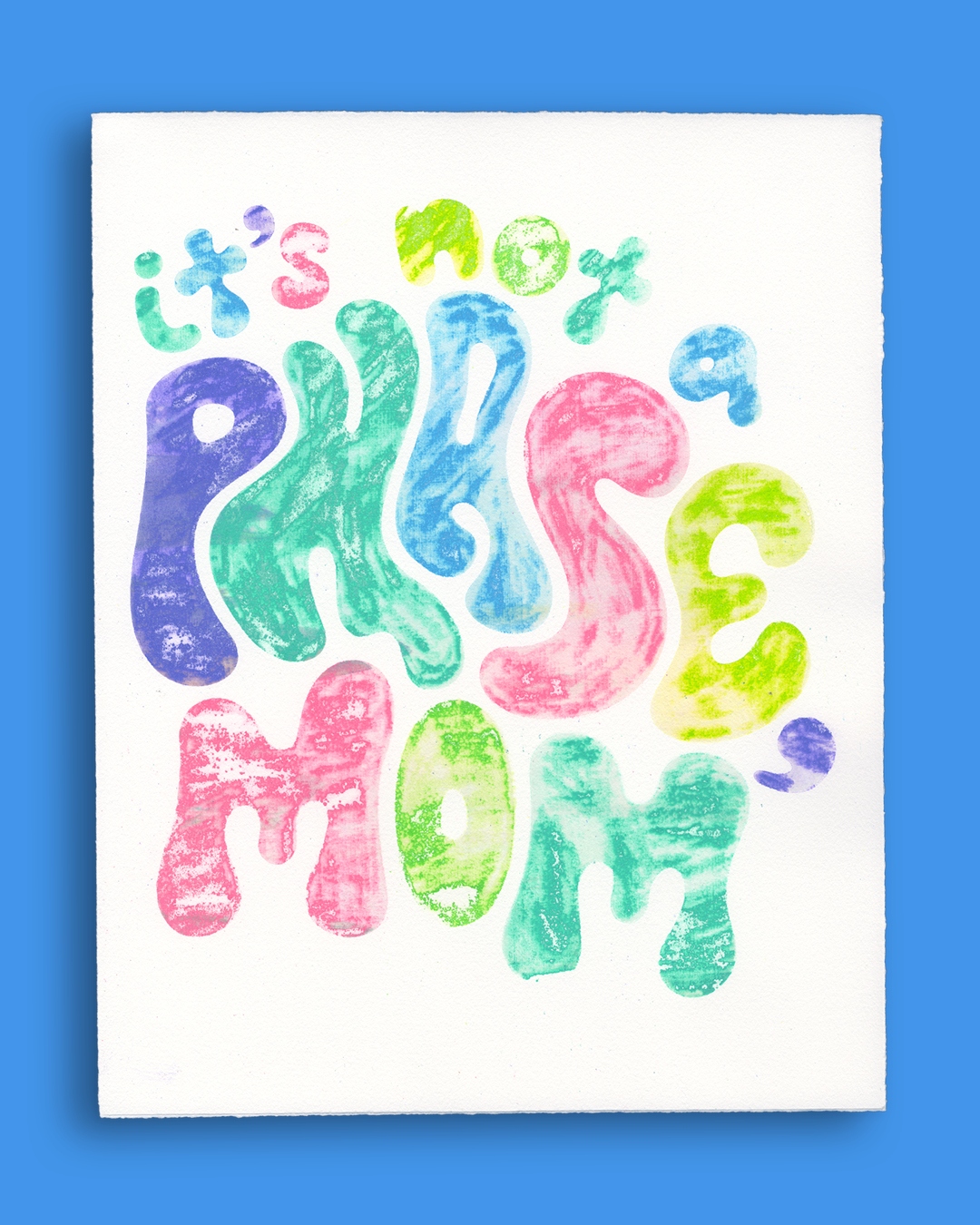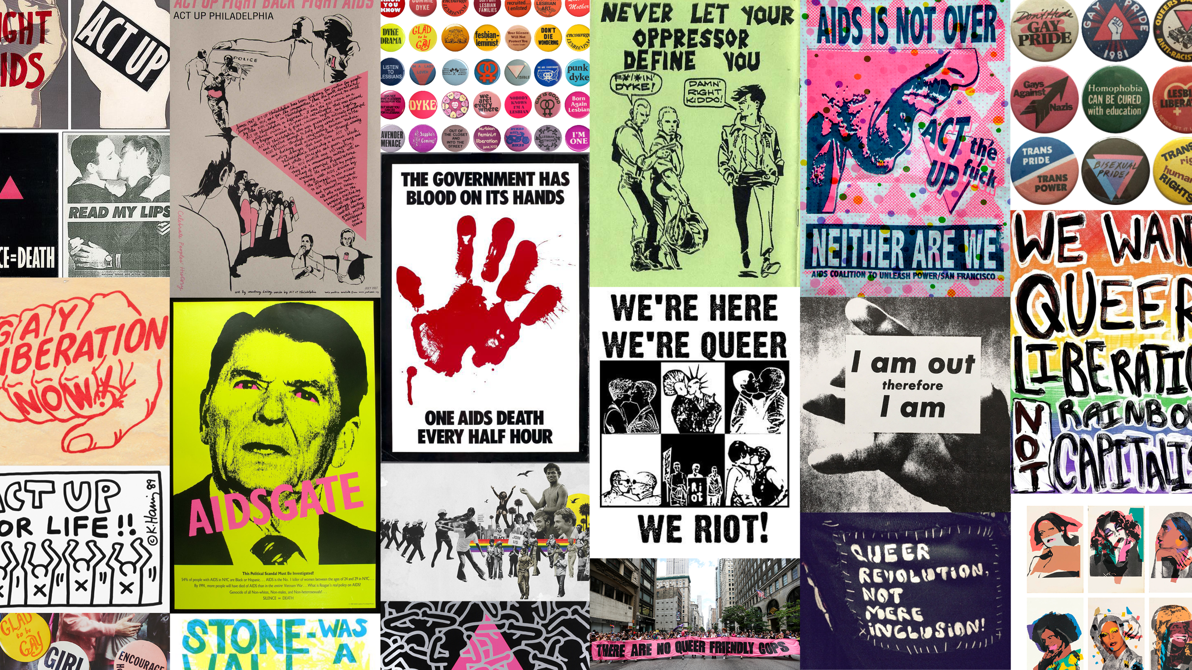
it’s not a phase emerged from my previous research about the history of queer design and printmaking, including the role printmaking played in disseminating information via flyers and zines during the peak of the AIDS crisis. This research has since evolved into an examination of the way queerness exists in present day design and print. From this research, I wanted to make personal work that emulates the values of queer design by embracing messiness and imperfection, while rejecting traditional standards of what makes “successful” art. With these ideas in mind, I decided to explore mono-screen printing; each print created with this method is completely unique, and the outcome is less predictable than traditional screen printing.
monoprinting: any printmaking method that creates unique prints which cannot be replicated
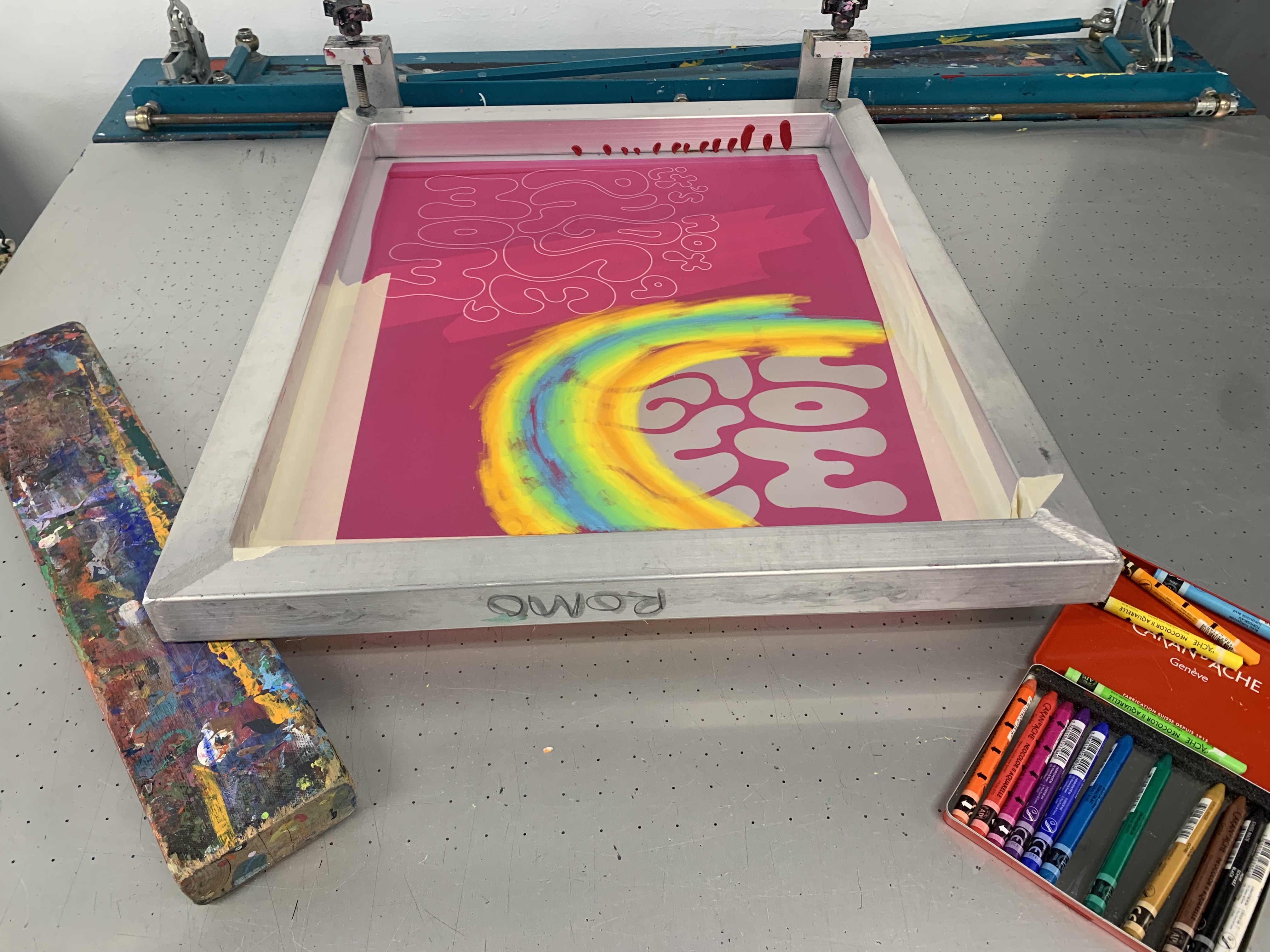
mono-screen printing: a specific form of monoprinting that is similar to screen printing but involves drawing directly onto the screen with a water-soluble medium and then printing with a clear ink such as extender base. Stencils are not necessary, but I decided to use them in both my research and capstone project.
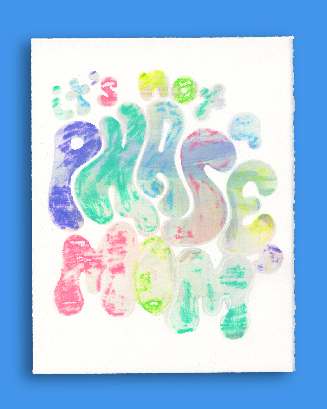
ghost print: a print created from the same matrix (in this case, the screen) after the original
“I also try to encourage students to take on things that they know nothing about, and to puzzle their way through it. I think that is a very queer thing to do. In the Queer Art of Failure, Jack Halberstam talks about how failure is a thing that queers are very good at doing, and are also used to doing. So I try to foster a space where the energy is towards making and not towards succeeding. I think that builds a stronger designer.” -nicole killian
“Capitalism rewards perfection—as defined by those in power. This is especially true in the art world, where the demand for smooth resolution and predictability creates unsustainable standards for who or what is allowed to be considered ‘successful’...New Prints 2022/Winter steps away from traditions of polish and perfection by making space for incompleteness, rawness, messiness, illegibility, risk, vulnerability, non-linearity, care, queerness, and non-normativity.” -unfinished, New Prints 2022/Winter exhibition statement
“At its heart, I think of being outwardly queer as a process of owning who you are. Growing more comfortable in that identity, or learning to enjoy the discomfort, and sharing it with the world. That experience can be as joyful as it can be painful. It can be celebratory, it can be defiant, and very often, it can be all of those things at once.” -John Voss of Queer Design Club
queer design history are.na created collaboratively with Gabby Lambeth & Liz Oliver